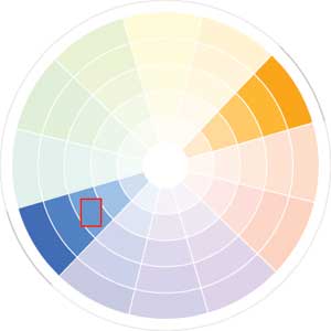


Complimentary colours are very high contrast so photographs that focus on complimentary colours tend to be very bold, even those that are not highly saturated.
|
|
|
Complimentary colours are very high contrast so photographs that focus on complimentary colours tend to be very bold, even those that are not highly saturated.
0 Comments
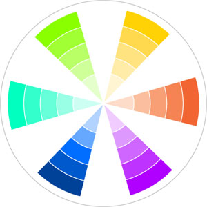 Tertiary colour photography can be quite variable in mood, particularly because many pick and choose which tertiary colours are used in their photographs in order to simplify their palette.
Phortography using tertiary colours typically has more difference in it's values than photography that focuses on primary colours or secondary colours. This is particularly true of photos using most/all of the tertiary colours because this helps to better the contrast between the colours and thus adds more depth to the image. 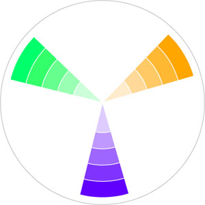 Secondary colours are often used like primary colours to create high contrast imagery and make a bold statement, though photos using secondary colours are often not so highly saturated.
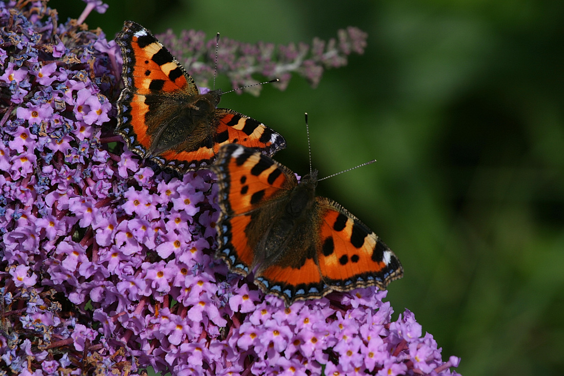
Nature photography tends to favour secondary colours. Green Is an expected healthy colour in nature and adding purple & orange is very striking and serves to make the image very colourful while also maintaining a balance. 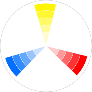 Primary colours in photography are often used in high saturation to make a bright and bold image in photography.
Sometimes these colours are given different values within the image. This is done to highlight one colour or tone down the striking power of the colours so that it is not too harsh on the viewers eyes. This can be seen in the parrot photo. Primary colour photography will sometimes fill the image with blue, yellow and red but other photographers may choose to add a white/black background (or some other element) to divide the colours and give them space from one another, or to better isolate the colours within the frame. Black or white is mostly chosen over other shades because it helps to maintain the bold impact of the primary colours. In photo images where the amount of each primary colour is not equal, yellow is often (but not always) used less than red or blue. This is most likely because the human eye does not perceive the spectrum of yellow light as well as it does red or blue light. This means it is harder to see different values within the colour yellow and thus when it used unless other colours are used for shading the photo can end up looking flat. As such most photographers tend to focus on red or blue to make their images more aesthetically pleasing. This presentation will show two main reasons to work with colours: the communication of colour and the application of colour .
The student should apply elements of colour theory to stylize the composition they have created. - primary colours - secondary - tertiary - analogues - complimentary |
AngharadAIT student 4587. Blog to archive work and progress in Design Principles class (DsgnPrn.A) Archives
October 2015
Categories |


 RSS Feed
